Hand lettered title for re-interpreted book cover of “Exit West”
The first of a self-initiated project to reimagine the covers of books I am reading myself. Around the time that I was reading this book, I was also looking for a book that I could (re)design the cover for. I liked the book a lot and decided to take this one as the first subject.
Objective and research
I decided I needed two versions of the cover: one for the printed version of the book, and one for an e-book version, with a more compact layout that would still read well on an e-reader or other device.
Spoiler alert: the description below reveals some of the story. If you want to read the book (highly recommended!) and be surprised, go get it at your favorite bookstore and come back when you’ve finished it.
Idea Generation
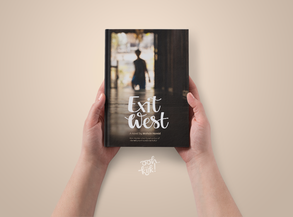
 Doors play an important role in the book as portals between different locations so for the basis of the cover I selected a picture with a strong symbolic meaning. The door in the picture leads from the dark to the light and a stranger is looking in who might be coming through the portal next. The reflection of the door opening on the floor provides a great space for a hand lettered rendition of the book title.
Although the book gives an impression of being set in a Middle-Eastern country, the author doesn’t specify the home country or specific religion of the two main characters. For that reason I have lettered the title in a fairly neutral style.
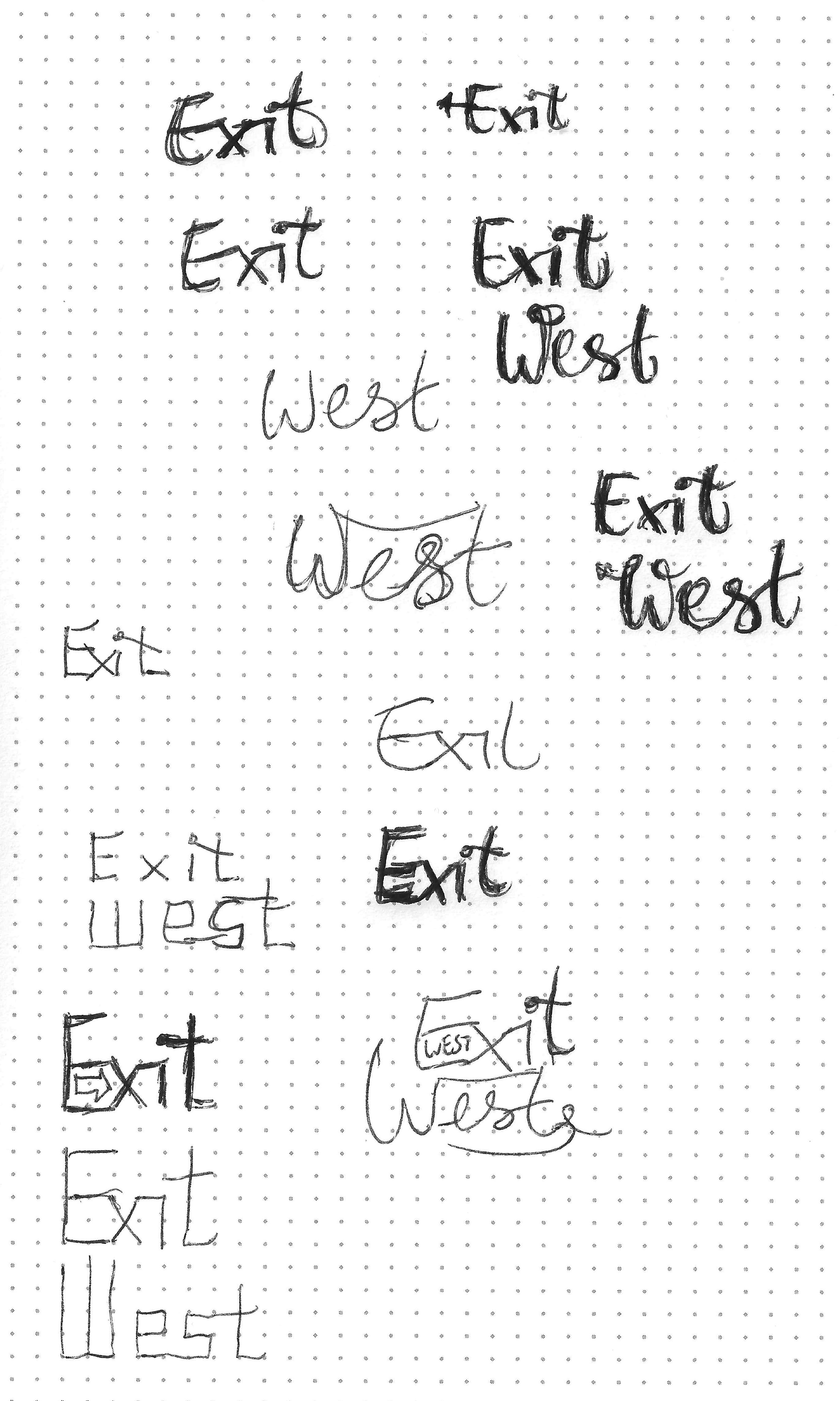
As usual, the process starts with pencil and paper, sketching many quick examples and trying out different approaches. I tried a few ways of incorporating an arrow to indicate “exit” and “west” but couldn’t find one that worked so I ditched that idea. I ended up with a rounded style with some interesting ways to connect the letters.
From sketch to final product
I used the final pencil sketch as a guide to draw the letters in clean vector shape in Illustrator, paying attention to consistency in letter heights, spacing and contrast and to the placement of the two words. Also, I checked that the design still reads well in small sizes.
The final concept
After lettering the title of the book, I put together both versions of the cover.
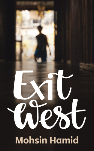
The ebook version (pictured left) I kept simpler with just the picture, name of the author and a larger title.
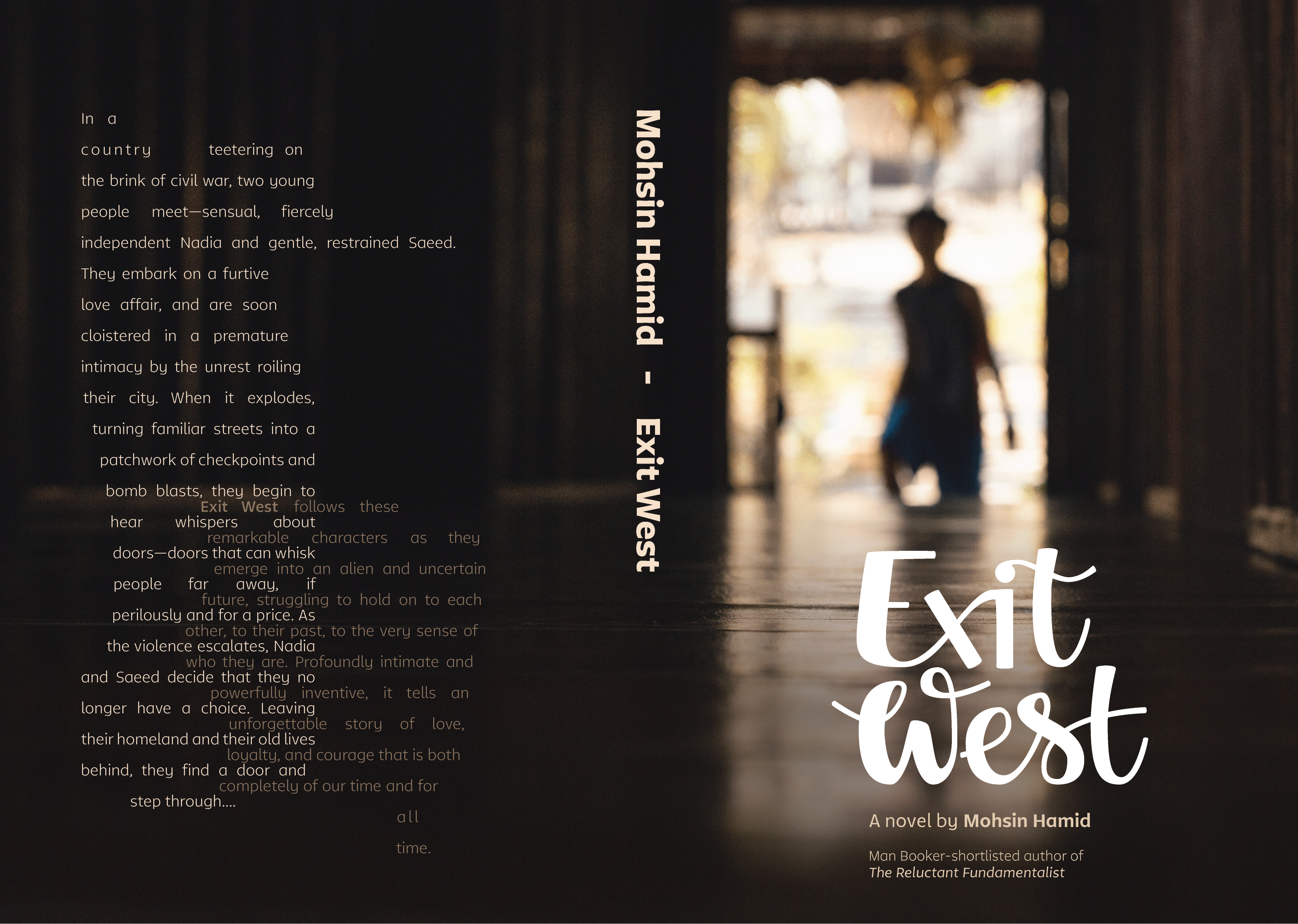
The hardcopy version (right) has more space so I included a little extra blurb on the front and showed more of the picture. Since the story is set against a background of civil war, refugee camps and mass migration, I’ve laid out the back cover in a “messy” way with irregular edges and two overlapping text blocks to reflect this.
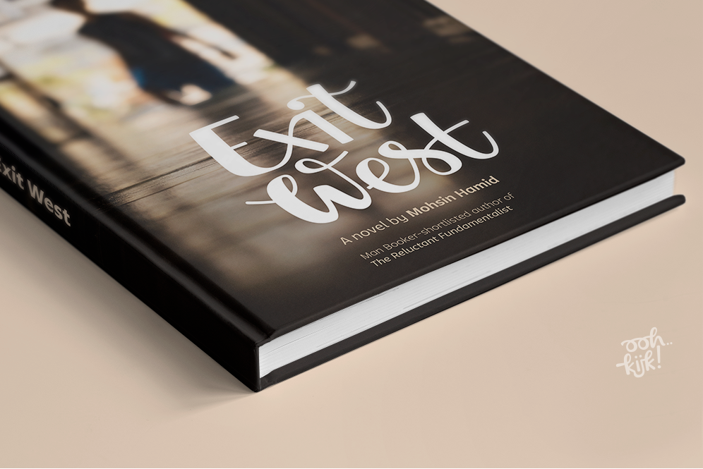
Finally I placed the cover on a number of mockups to show what the book would look like in real life.
Credits
Font: Tikal Sans made by Latinotype
Picture: Peter Hershey via Unsplash Peter Hershey
Back cover text: the book’s page on Amazon


