")


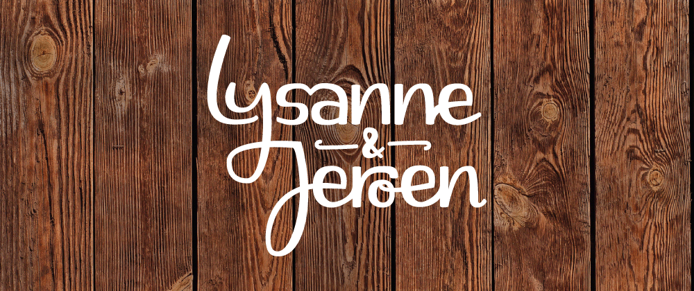
Handlettered names become a logo for the entire wedding day
Objective and Research
I was approached by Lysanne and Jeroen to design their wedding stationary. I spoke several times with the couple and visited the wedding location, the converted barn on an old farm, to get a thorough understanding of their wishes.
Sketches
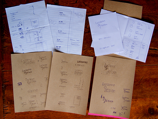 After understanding the desired style, I started sketching. Over several iterations I ended up with the final design - a friendly rounded mark without frills. The connected ‘y’ and ‘J’ symbolize the union of marriage while some letters were tucked away in or under others to provide a playful element.
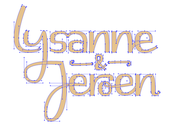
Digitization
The master design was scanned and used as a reference to draw the vector illustration, achieving a clean look. The unique handmade nature comes through in several places such as the ‘sa’ ligature with a subtle heart shape and the e’s that are connected from each preceding letter slightly differently.
Final artwork
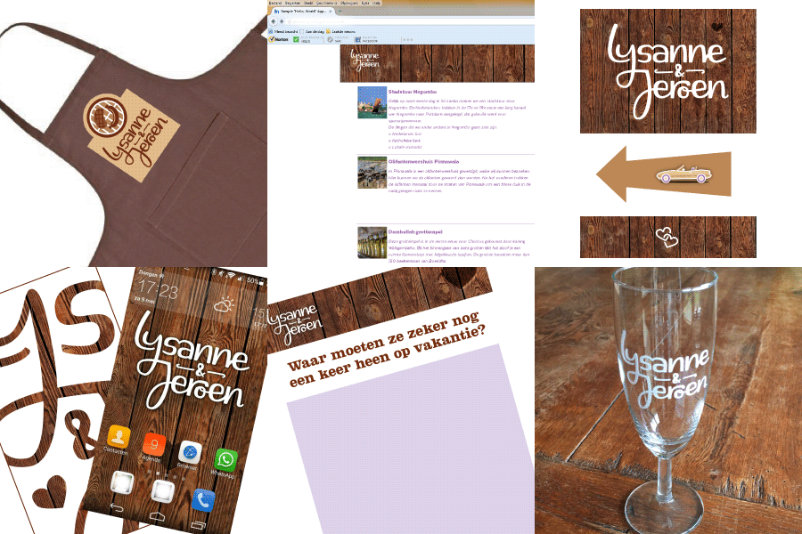
The final vector art was colored and exported in a number of formats to be used on the wedding invites and other materials.
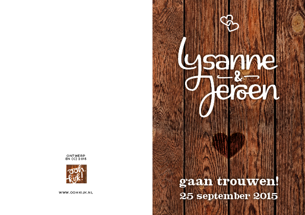
The design was used consistently thoughout the day and turned into a proper logo to unify the entire wedding day. For example, the apron pictured below was worn by the wait staff at the big party, and the printed champagne glasses were used as presents for the wedding guests.
Credits
Wooden plank pictures by Benjaminlion (via Creative Market)
Squarendon Extra Bold typeface by Fenotype
Texta Medium and Text Black typeface by Latinotype