")


A great beer with a great story
Hand lettering for the labels of a series of beers based on historical buildings in Breda.
Objectives
Breda is a city with a long and illustrious history. This history is told and celebrated through a series of beers, each one highlighting a historical building in the city, with a short descriptive text and a link to a website with more detail. To stand out on the busy beer aisles, the following guidelines were established for the design of the labels:
- Original and modern looking label, also in its shape – not a classical label
- Should not be a cheap-looking / touristy beer
- Less is more
- Start of a series of beers with comparable labels
- Will contain a relatively large amount of text, should remain readable
Research
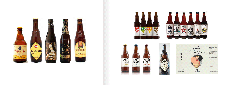
First, I researched the beer labels that are commonly used at the moment. That sounds as an excuse to be in the pub all day, but you know you can’t rush this phase ;-). The annual beer label competition of the BAV (link in Dutch) gives a great overview of the range of labels being produced. .
In comparison with the more classical labels (heavy use of brown/gold colors, references to abbeys, blackletter typography), the more modern labels are clearly different in shape and design (more colorful, white backgrounds, more graphics, wider range of typography).
With the above guidelines in mind, I chose a design direction with a light background and a strong graphic to draw the attention. The below comparisons shows a number of such labels in a comparison with the more classical approach.
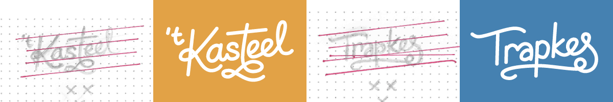
Lettering
The names of the historical buildings will of course be hand lettered for the labels. As an example for the beer series I have started with two well-known buildings in Breda. To keep the letters readable on the labels I have used a fairly thick and uniform stroke, without any fine details. The diagonal baseline adds a dynamic to the lettering.
Using my sketches as guides I have digitized the lettering in vector format so they can potentially be used on other materials without loss of quality.
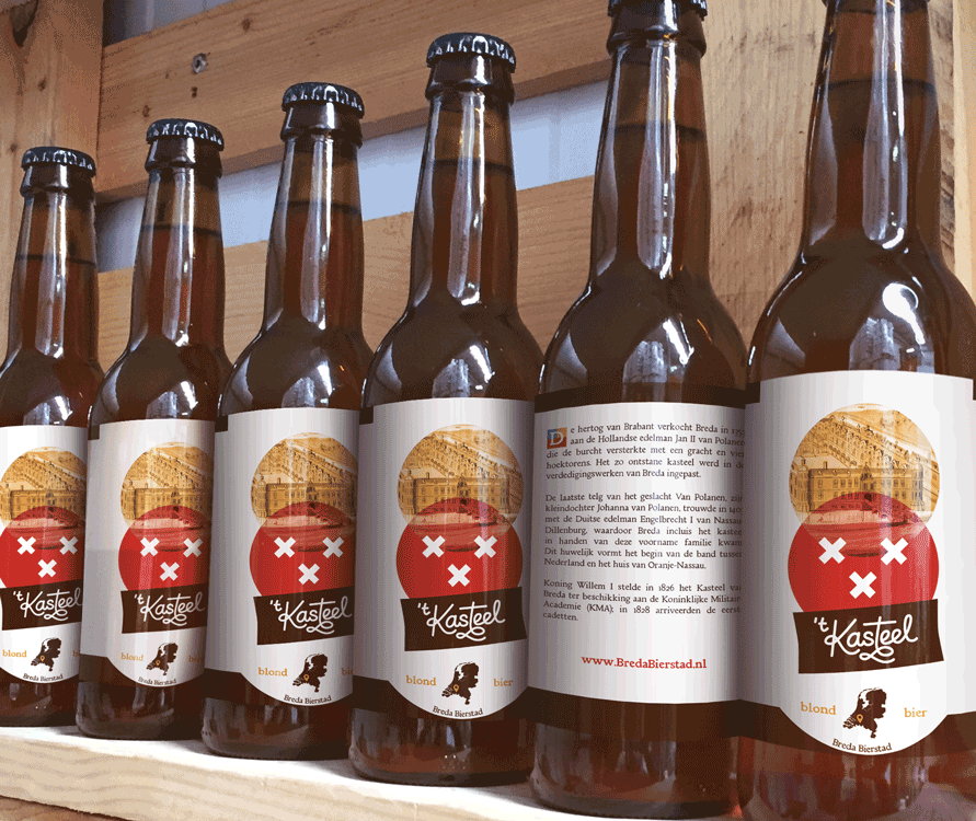
The final concept
The end result is a modern label with lots of white space, without visual frivolities and with a strong image prominently shown on the front:
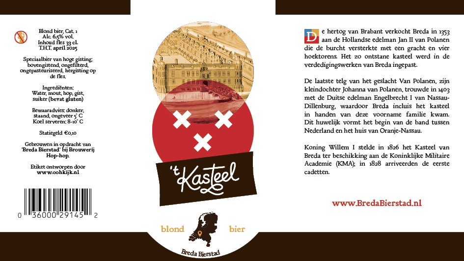
The underlying grid gives the label structure and guides the attention through the use of color, size and grouping:
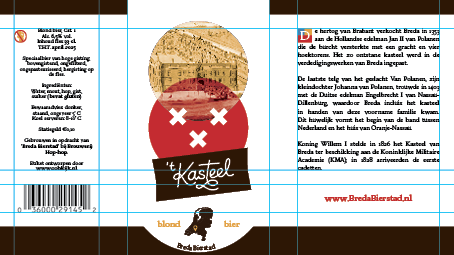
The design shows several links to the history of the city. First of all, the space around the main illustration subtly has the shape of a shield (something that strangely enough isn’t used a lot in beer labels as far as I’ve seen).
The main illustration itself uses old photographs or illustrations of the building in question.
The color scheme is based on the coat of arms of William of Orange, the most famous resident of the “Kasteel”.
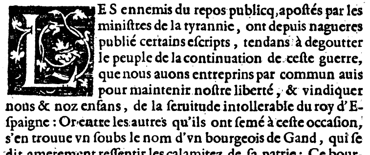
The descriptive text on the right side of the label is lightly modeled after book printing of the 16th century, with an initial that uses the colors of the William of Orange coat of arms, and a “clean” digital version of a classical typeface.
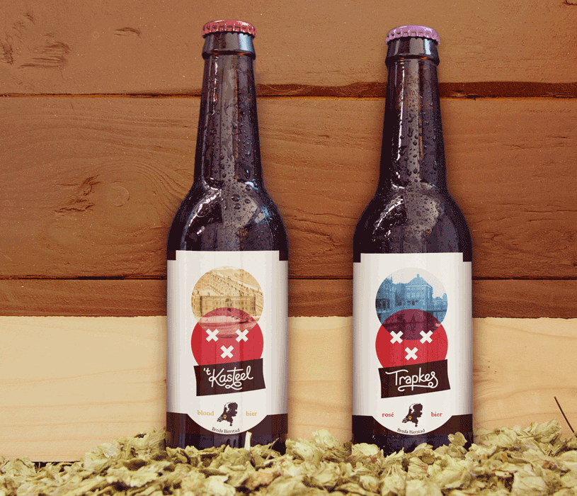
Lastly, the design is created to allow reuse of the label for the various beers in this series, of which the “Kasteel” beer is the first. The design can be varied in different ways such as:
- The city-arms of Breda (three white crosses on a red background) in the bottom circle will be the same on all labels, but the color and illustration in the top circle can be changed.
- The name of the building will of course be hand lettered and added
- The bottle cap can be done in a color to match the illustration
- The descriptive text on the right side of the label will be changed and a different initial will be drawn.
See the below example of a second label in the series:
Credits
Mockups van SmartDesign on Creative Market: