")


Logo for a consulting firm with a nod to history
Objectives
I was approached by Colin Shearer to design the logo for the analytics consulting firm Decisions from Data he just started.
During the initial consultation I learned about the image the logo should be projecting with keywords such as pedigree, reliability, innovative and not boring. It would be fine if the logo is a little quirky. The logo would primarily be used on a website, business cards and invoices, and possibly on PowerPoint presentations. The logo should be able to remain readable when documents are printed/scanned (for example when a contract is signed, scanned and returned via email).
 Also, Colin would appreciate it if the logo would show a relation to the logo of Integral Solutions Ltd. (abbreviated in the logo as ISL), a previous company he founded.
Research
After the initial consultation I researched the logos used by other organisations in the analytics consulting market. I organized them by the type of logo, colours and types of fonts used. The conclusion of this research is that most of the organization have very clean, corporate logos with sans serif fonts, cool colour palettes (blue/green) and not a lot of abstract symbols.
After the initial consultation I researched the logos used by other organisations in the analytics consulting market.
I also created a list of word associations with Decisions from Data’s business domain and Colin personally, and looked in my archive for examples of creative approach that would fit the objectives.
I shared my findings and recommendations with Colin and we settled on the direction to take – a hand lettered logo that is different enough from the typical logos to set Decisions from Data apart, with of course a nod to the ISL logo.
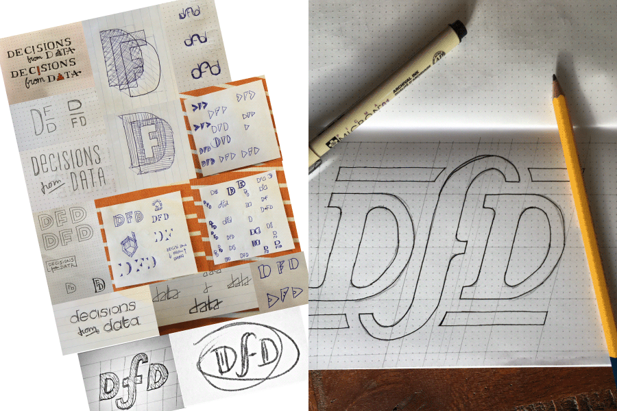
Idea generation
After understanding the desired style, I started sketching out a number of design approaches, evaluating those against the stated objectives. Over several iterations I ended up with the final design, a wordmark of the abbreviation “DfD” in a unique style.
I created the logo in a solid serif font to differentiate from the dominant sans serif approach in the market. Colin’s long experience in analytics is well represented this way, without coming across as old-fashioned. The letters are italicized and the “f ” has a crossbar on one side to indicate forward motion and innovation.
And the logo shows its kinship to the ISL logo through a similar angle of the letters, the horizontal lines above and below the letters and a middle “initial” that breaks through those lines.
From sketch to final product
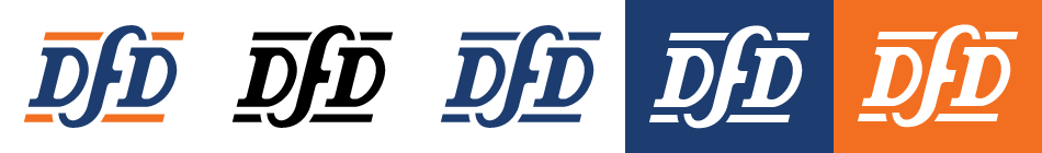
The master design was scanned and used as a reference to draw the logo in precise vector format. I made a number of optical corrections, enlarged the crossbar on the “f ” to show better at smaller sizes and adjusting the kerning for a better balance in the space between the letters. I made sure the design was “pixel perfect” so it would show crisply on the website.
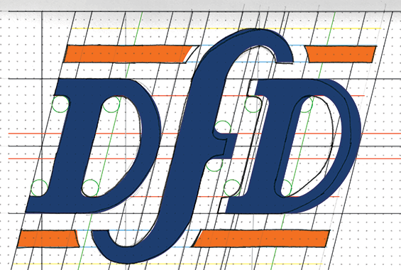
The logo is rendered in a colour blue (similar to the colour used in the ISL logo) and a contrasting orange.
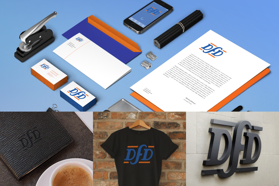
To see what the logo would look like in the real world, I placed it in a number of mock-ups to display the logo on stationery, on a t-shirt, as a wall plaque and other situations.
The final concept
The final logo was exported in a number of file sizes, file formats and colour versions to be used on the company’s website, stationary and other documents.
Lastly, I wrote a document that explains when to use which logo file, the computer codes of the colour palette, and how to set up the branding colours in Microsoft Office applications