")


![]()
A sporty logo for a new volleyball school
Volley4U is a volleyball school for young players who want to develop their talents beyond the regular training at their club. After the Dutch Volleyball Association stopped their regional talent development programs, several clubs in West-Brabant joined forces to found this new school as a replacement program for their players to grow.
Objective and research
As a newly founded organization, Volley4U needed a logo for its initial communications including their new website. No specific guidance for the logo design was given, other than that it should appeal to the young audience.
Designed for the players?!
To get more context, I first studied the logos of other similar organizations. I found that they were all fairly similar logo styles; simple wordmarks with cliché illustrations and “corporate” sans serif fonts, not something that really looks designed to appeal to the young players. A hand lettered logo would certainly set this volleyball school apart from others.
Idea generation
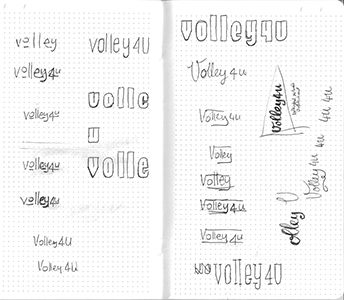
I sketched various design options and chose a bold, rounded, friendly, organic wordmark. I avoided the use of cliché illustrations like a ball or a net, as it’s already quite clear from name and subtitle that this is about volleyball.
 Because this school is a collaboration of different volleyball clubs I also developed a new color scheme that would be different from the colors already used by the individual clubs. The background for the logo is a blueish grey that reminds of the indoor flooring often used in sport halls, with the logo itself in a bright orange as contrasting color.
From sketch to final product
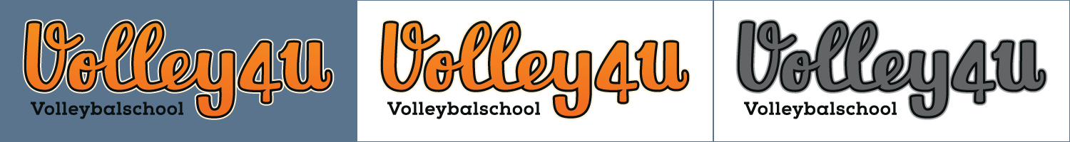
 From the sketch, I drew the logo in clean vector format in Adobe Illustrator. I applied a double border that is often used in logos for sports teams and that helps contrast the logo from its background. A subtle feature of the logo are the “nicks” that are added to where the strokes of the letters cross to add depth and a little whimsical touch.
For the subtitle I used the Nexa Slab xBold typeface.
The final concept
I exported the logo in different file formats and sizes, including a square version of the logo to use for social media profiles, and in different color treatments (regular, transparent background and greyscale respectively).
I also delivered the color codes in CMYK, RGB and HEX for the entire color palette shown above.
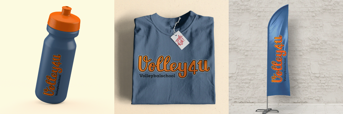
Lastly, I placed the logo in a number of relevant mockups to show how the logo would work in real life situations like a t-shirt, water bottle and banner.
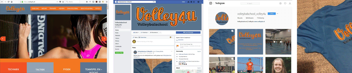
Usage
In the meantime, the volleyball school has started successfully, with dozens of players participating in selections and starting the trainings. The logo is in full use as shown in the examples below – on the website, social media and on t-shirts printed for the players and staff participating in this year’s trainings.